Brand Image
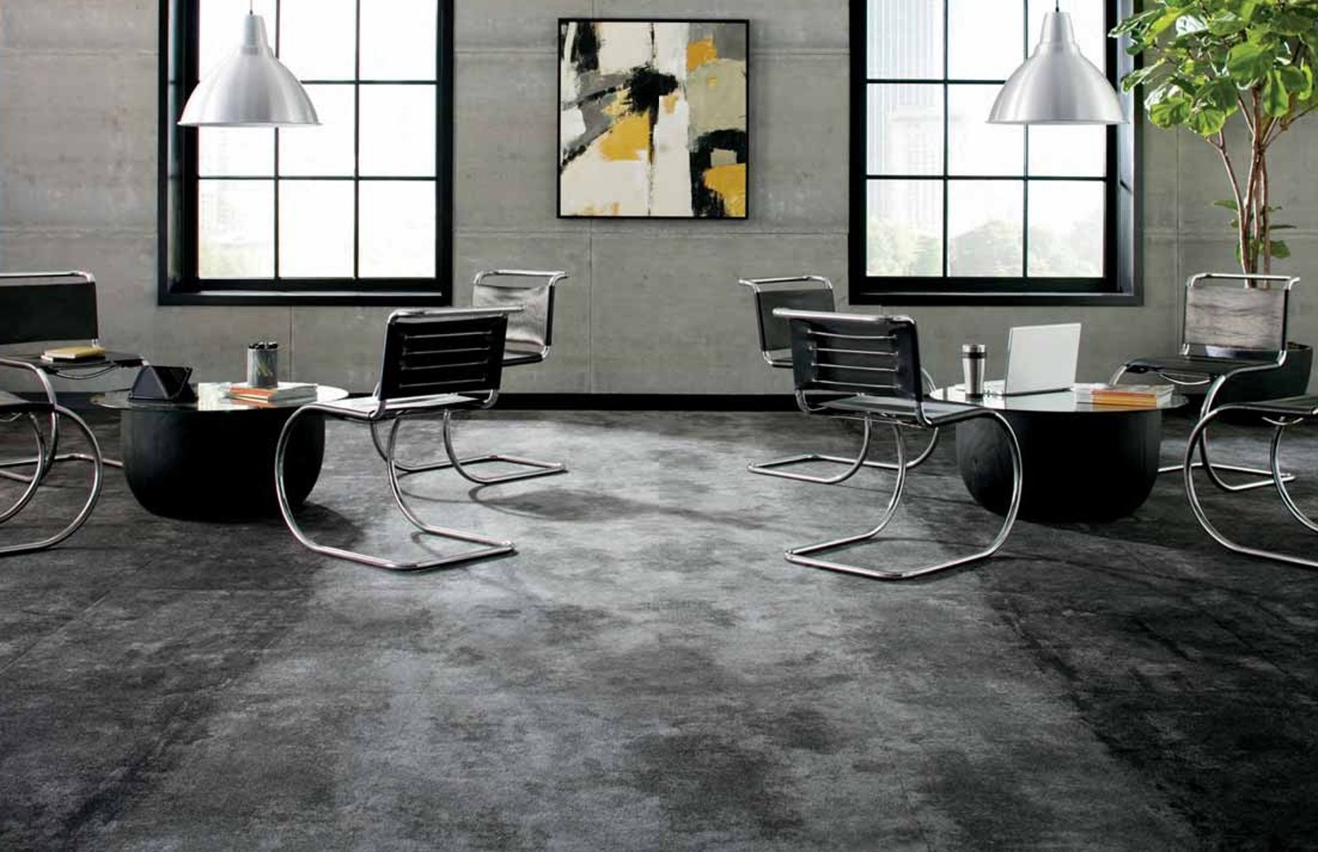
The office environment reflects a company's image, and its interior leaves a lasting impression on visitors, employees, and clients. Therefore, there is a growing trend to enhance corporate branding and maximize visual impact through office and commercial space styling to create a stronger impression on visitors. Today, we will share interior design tips that strike the right balance to showcase and enhance a company's brand image.
브랜드 이미지를 살리는 환경이란?
'Interior Design that Enhances Brand Image' refers to a space designed to extend the brand image of a company or organization. For example, incorporating the company logo or name throughout the office space or using specific color schemes when selecting furniture and paint colors could be considered. This serves as an alternative to bland and featureless corporate design, instilling a sense of pride in employees and injecting personality into office design. However, excessive branding can be visually overwhelming and potentially off-putting to employees and visitors, so balancing branding in commercial spaces requires careful consideration.
브랜드 이미지를 통합시킬 아이디어
Color
Signage and Directional Signs
Flooring
Color
Using appropriate colors can easily apply the brand image to the space. For example, using the company logo colors as the main accent colors throughout the space. However, it is important to consider how to use color tones to make people who live in that space feel comfortable every day.
For example, using bright colors extensively can reduce concentration, so it may not be desirable to have entire walls in the bright corporate logo color in each room. Instead, incorporating color into the space through blinds, window coverings, or furniture can be a more subtle and effective choice.
Additionally, focusing the color-centric brand image in significant spaces such as the main reception area or lobby is another approach. This helps create a visually appealing environment without causing visual discomfort or eye fatigue in the office space, making a strong impression on employees or visitors when they first enter the building.
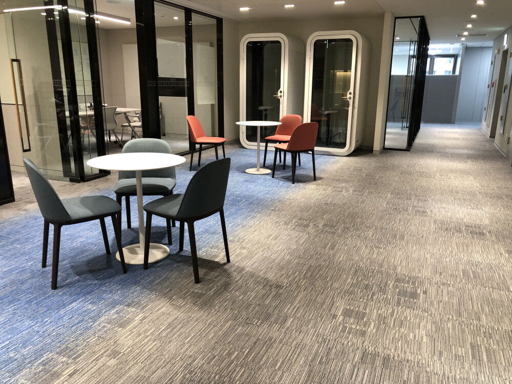
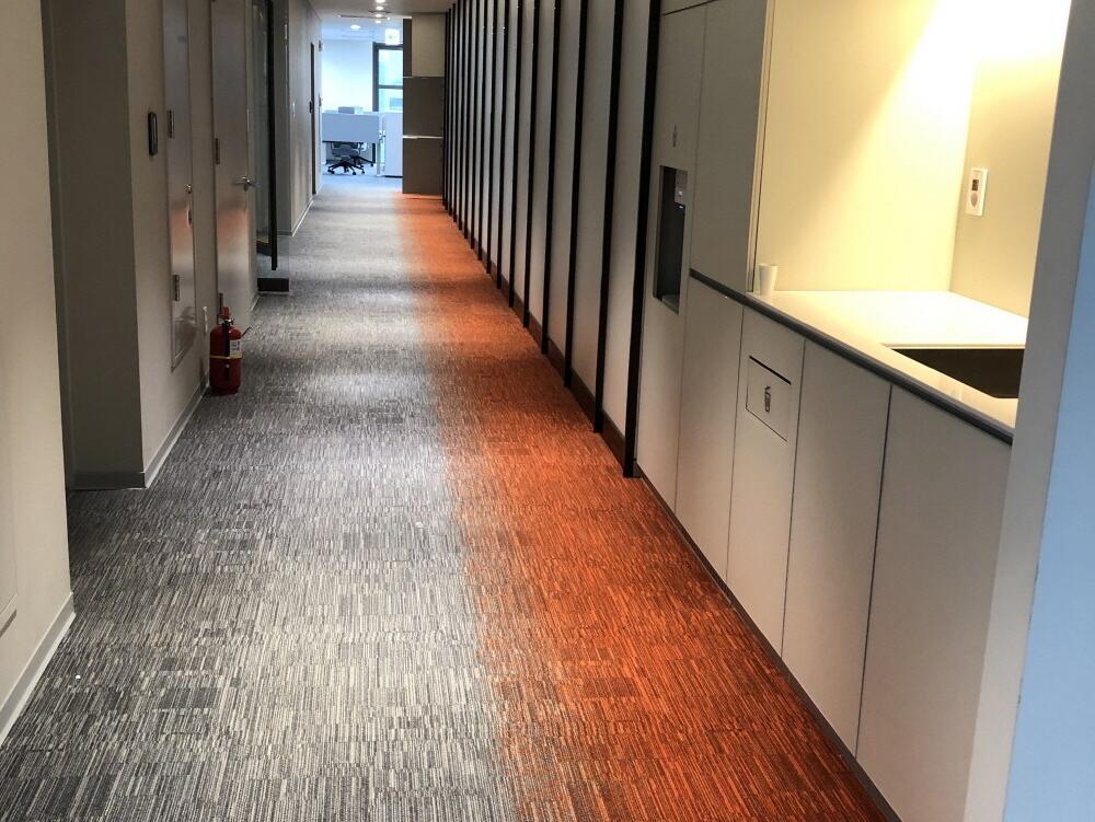
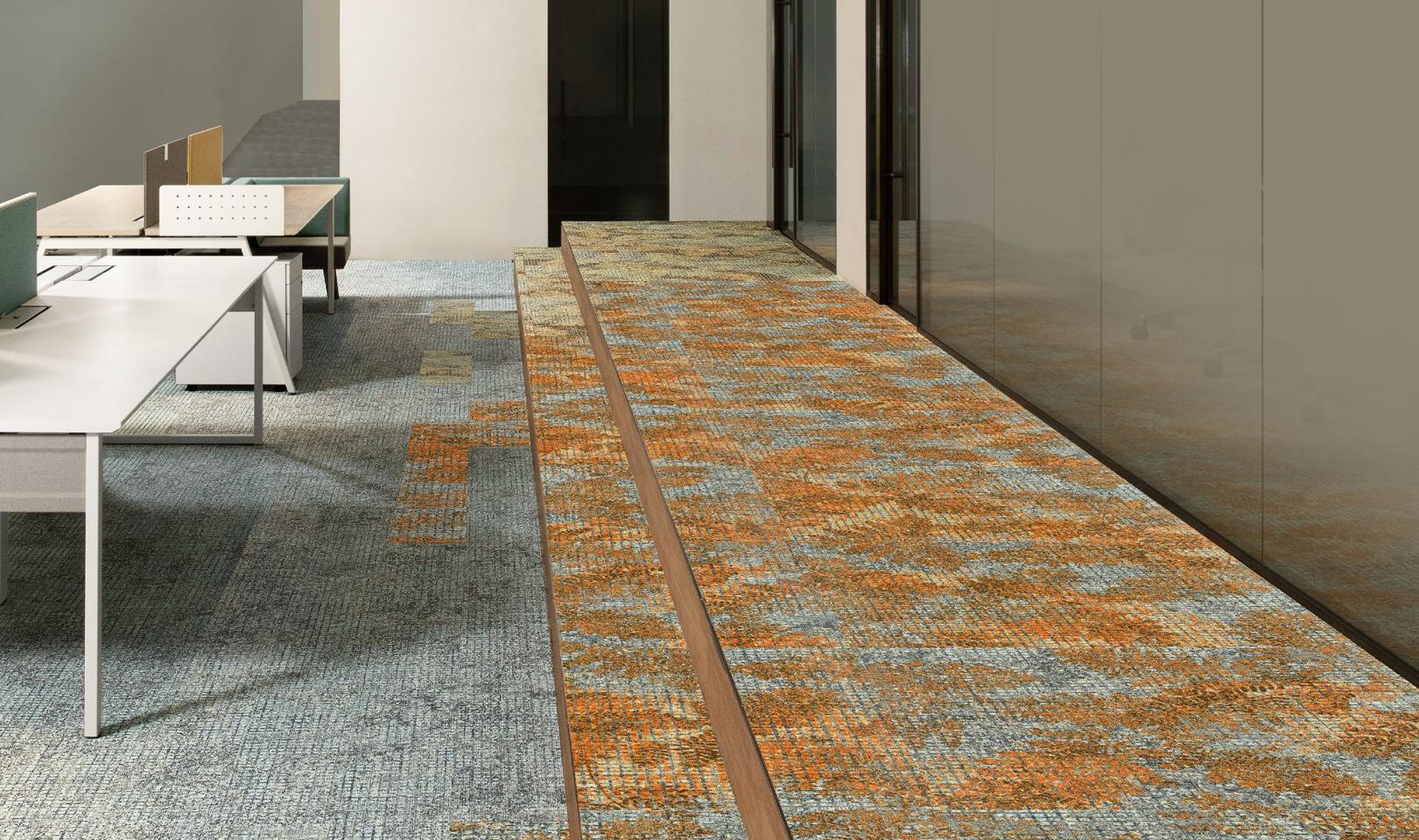
A domestic C company that incorporates the colors of its company logo into its carpet
Signage and Directional Signs
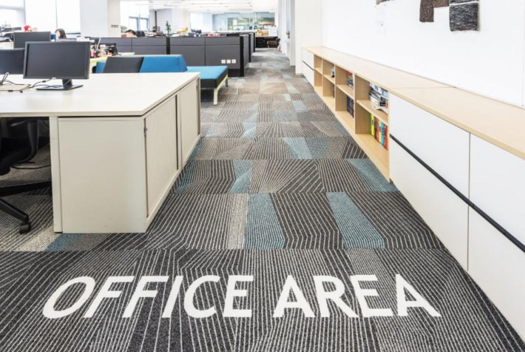
Using the same font as specified in the company's logo or brand guidelines for signage is another way to reinforce the brand's image. For example, placing signs in conference spaces or meeting rooms with a specific theme can add personality to the space.
Moreover, you can incorporate visual cues into wayfinding signs themselves or use colors on the signs to guide people through pathways and other areas. For example, using floor tiles with a color contrasting the overall flooring to guide visitors to key facilities such as restrooms or reception areas is another idea.
Flooring
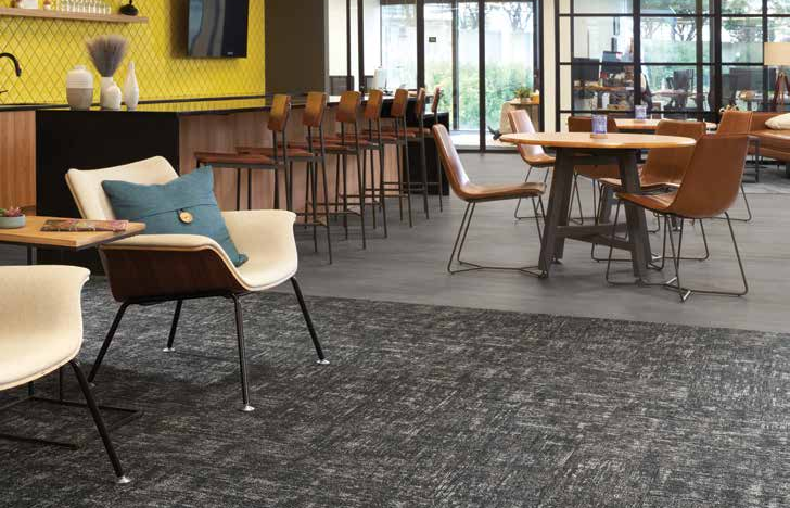
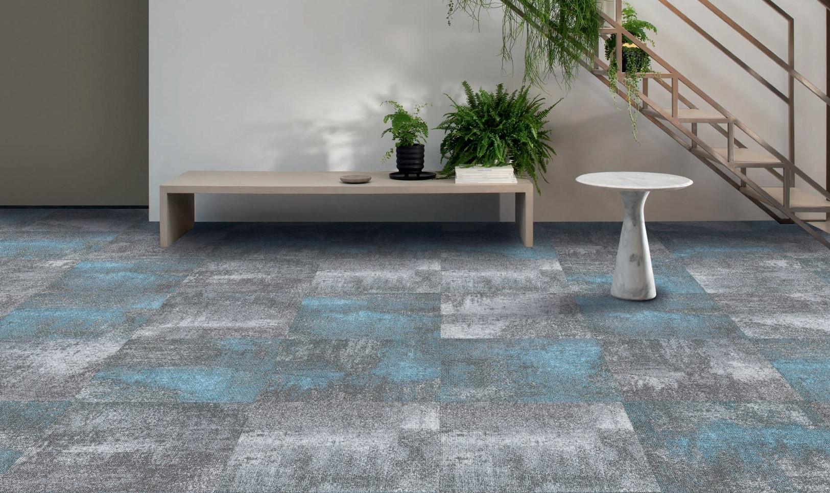
Choosing the right flooring can be a unique way to integrate branding elements into commercial spaces. If you are considering carpet as the flooring option, how about trying Milliken carpets with digital printing technology? Milliken carpets can accurately and vividly depict patterns and limitless color gradients, regardless of the size of the floor. Consider utilizing this precision technology to design carpets with your company logo.
